Anzeixer
Streamline View Definitions for Responsive Web Design
Responsive web design requires cooperation of CSS and JavaScript. This often results in values being defined redundantly, making code harder to maintain.
For this reason we use a proven set of CSS and JavaScript snippets at Zeix. We are releasing it under the name “Anzeixer”.
Feedback welcome.
What Is Anzeixer?
Anzeixer is a set of CSS and JavaScript snippets that lets you define threshold values of views once, saving time and reducing errors.
What Does Anzeixer Do?
Define Views in CSS with @media Rules
Define views that use media queries to apply CSS rules at specific breakpoints and give the views descriptive names. In addition to distinct views for smartphones, tablets and computers, you can also create views for portrait and landscape orientations and for various pixel densities.
/**

 * Medium

 */

@media screen and (min-width: 768px) and (max-width: 999px) {


  /* Anzeixer */

  body:after {

    content: 'm';

    background: #ffe6a0;

  }

}
Show the Current View During Development
During development, you need to know that the correct CSS rules are being applied and that the correct JavaScript is being run. Add the dev class to the <body> tag to enable an indicator at the bottom left corner which displays the name of the current view.
<body class="dev">
Query the Current View with JavaScript
You probably need for certain user interface behavior to change depending on the view. For example, you might replace tabs with an accordion on very narrow screens. By using JavaScript to query the current view from CSS instead of defining the threshold values a second time in JavaScript, you reduce complexity and the likelihood of errors.
var isXSmall = function() { return (getSizeIndex() === 0); };

// target smallest devices only


var isSmall = function() { return (getSizeIndex() < 2); };

// target all small devices


var isMedium = function() { return (getSizeIndex() === 2); };

// target medium devices only


var isLarge = function() { return (getSizeIndex() > 2); };

// target all large devices


var isXLarge = function() { return (getSizeIndex() === 4); };

// target largest devices only
Improve Performance with Unified View Change Events
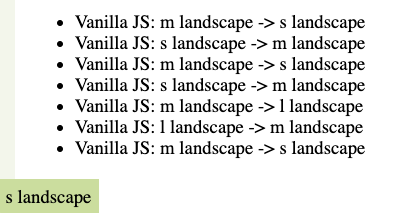
On pages with a lot of JavaScript, having each script listen for the browser's resize events individually can impose a significant performance penalty. Many scripts don't need to know the specific viewport size, only which view is in use. Anzeixer can help by triggering a viewchange event only when a breakpoint threshold is crossed, letting your scripts ignore resize events they don't need.
/**

 * listen to viewchange event

 */

document.addEventListener('viewchange', function(e){

  'use strict';

  var li = document.createElement('li');

  var text = document.createTextNode('Vanilla JS: '
 + e.detail.originalView + ' -> ' + e.detail.currentView);

  li.appendChild(text);

  document.getElementById('log').appendChild(li);


}, false);
Who's behind Anzeixer?
Anzeixer is developed by Zeix's user interface development team.
Anzeixer is released under the MIT license, which allows you to use it for any purpose, as long as you provide attribution and release us from all liability.
Contact: Esther Brunner
More about Zeix, agency for user-centered design